The obvious benefit of a burndown chart is that it provides an updated status report on the progress of the project. Having a visual representation of this most important data keeps everyone on the same page.
Also, by displaying it prominently for all to see, it keeps everyone involved and encourages the team to deal with issues before they become problems. Therefore, the bigger the chart, the better. It should be the focal point of the workspace, so that it cannot help but direct conversation towards the project and its progress.
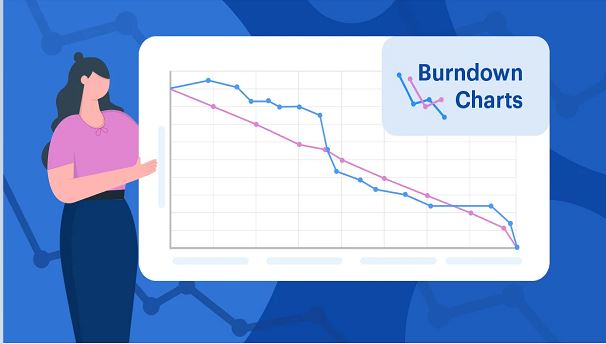
The burndown chart is extremely helpful, too, because of its simplicity. It’s a great way to see the velocity history of the project. Velocity is an agile term that means the total effort estimates associated with user stories that were completed during an iteration.
What Are the Limitations of a Burndown Chart?
The burndown chart doesn’t reveal everything. For example, it only shows the number of story points that have been completed. The burndown chart doesn’t show any changes, for example, in the scope of work as measured by the total points in the backlog.
Therefore, it can be hard to tell if changes in the burndown chart are because of the backlog items having been completed or because of an increase or decrease in story points. Having a burnup chart can resolve this problem by having a separate line in the graph for overall backlog size.
However, neither a burndown nor a burnup chart offers any indication of which product backlog items have been completed. Therefore, a burndown chart might show progress but not whether the team is working on the right thing. So, these charts are a way to show trends rather than whether the team is delivering the right product back log items.
It Relies on Good Estimates
Another issue with burndown charts concerns the accuracy of the ideal work line. Whether the actual work line is above or below the ideal work line depends on the accuracy of the original time estimates for the tasks. Therefore, if a team is overestimating time requirements, progress will appear on track if not ahead of schedule. But if they are underestimating time requirements, it will appear that they are behind schedule.
There is a way to respond to this issue, and that’s by incorporating an efficiency factor into the burndown chart. Therefore, after the first iteration of a project, the efficiency factor is recalculated to allow for more accuracy.
History of the Burndown Chart
The burndown chart developed out of the Scrum community and was first used to manage software projects and other related efforts in about the year 2000. It was first described by Ken Schwaber, who is credited with its invention. At that time, he was working at Fidelity Investments and created burndown charts to provide Scrum teams with a simple tool to help them chart their progress.
By 2002, the burndown chart was gaining in popularity within the Scrum community. It has since moved beyond Scrum as a useful tool for any manager seeking to chart progress on a project.

Comments are closed