At times it feels like there’s never enough hours in the day to get everything done. Often, the powers that be want things done yesterday, even though it’s an impossibility. Their intent is clear: get it done fast.
Therefore, clever managers know that time is a constraint which they’re always working to control. The better data they have related to time and work, the better they can adhere to the schedule and get the project completed on time and within budget.
A burndown chart is one such tool for collecting that project data. Using a burndown chart is a means of seeing how much work is left and how much time there is to do it in. It’s a graphical representation, offering in a picture what a thousand words might not be able to communicate as clearly.

What Is a Burndown Chart?
A burndown chart is a graphic representation of how quickly the team is working through a customer’s user stories, an agile tool that is used to capture a description of a feature from an end-user perspective. The burndown chart shows the total effort against the amount of work for each iteration.
The quantity of work remaining is shown on a vertical axis, while the time that has passed since beginning the project is placed horizontally on the chart, which shows the past and the future. The burndown chart is displayed so everyone on the team can see it and is updated regularly to keep it accurate.
Variations of the Burndown Chart
There are two variants that exist for a burndown chart. A sprint burndown is for work remaining in the iteration. When illustrating the work remaining for the entire project, the chart is called a product burndown.
How to Read a Burndown Chart
The burndown chart has several points. There’s an x-axis, which is the project or iteration timeline. The y-axis is the work that needs to get done in the project. The story point estimates for the work that remains is represented by this axis.
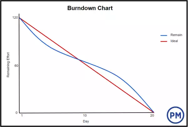
The project starting point is the farthest point to the left of the chart and occurs on day zero of the project or iteration. The project end point is farthest to the right and marks the final day of the project or iteration.
Ideal Work Remaining Line
There is an ideal work remaining line, which is a straight line connecting the start point to the end point. It shows the sum of the estimates for all the tasks that need to be completed. At the end point, the ideal line crosses the x-axis and shows there is no work left to be done. This line is based on estimates and therefore not always accurate.
Actual Work Remaining Line
Then there is the actual work remaining line that shows the actual work that remains in the project or iteration. At the beginning the actual work remaining and the ideal work remaining are the same, but as the project or iteration progresses the actual work line will fluctuate above and below the ideal work line. Each day a new point is added to this line until the project or iteration is done to make sure it’s as accurate as possible.
If the actual work line is above the ideal work line, it means there is more work left than originally thought. In other words, the project is behind schedule. However, if the actual work line is below the ideal work line, there is less work left than had been predicted and the project is ahead of schedule.